Table of Contents
- 1. “Settings” page
- 2. Custom blocks
- 3. Skip blocks
- 4. Skip site navigator
- 5. Exclude element
- 6. Main menu
- 7. Adding a Title to your Links
- 8. Sidebar
- 9. Show Help Text
- 10. Use Adaptive Contrast
- 11. Social Titles
- 12. Activate Screen Reader Blocks
- 13. Add New Tooltip
- 14. Add New Alt
- 15. Add New Aria-Label
- 16. Use Keyboard Mode on Toolbar
- 17. Use Autofocus With Anchors
- 18. Set Menu Names
- 19. Popup Configuration
- 22. “Submit” button
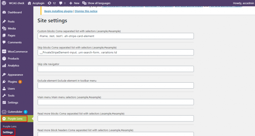
1. “Settings” page
To open the “Purple Lens” “Settings” page go to the “https://site address/admin” link, click on “Purple Lens” on the left bar, and then on “Setting” (Image 1)
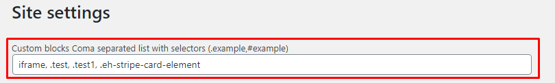
2. The “Custom blocks” text field
- Explanation:
- The “Custom blocks” text field is used to highlight new parts of your website that might have the wrong tags, and thus might be passed over by a screen reader. These highlighted sections are important for users who use the “Voice control”, “Screen reader”, “Text reader”, or “Keyboard” functions so that they can navigate your website.
- Instructions:
- Add the tag, id, or class of the element that you want to highlight. If you want to highlight multiple elements, separate them by a comma and a space.
- For a class, add a “.” at the beginning, and for an id, add a “#” at the beginning (Image 2)
- To find the required HTML selectors, review the Developer tool and HTML instructions
- Add the tag, id, or class of the element that you want to highlight. If you want to highlight multiple elements, separate them by a comma and a space.
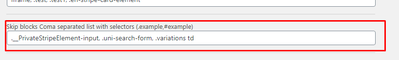
3. The “Skip blocks” text field
- Explanation:
- The “Skip blocks” text field is used to skip over any parts of your website that you don’t want the “Screen Reader”, “Text Reader”, or “Voice Control” to access.
Example: If you have a background image that is just for decoration, you might want the screen reader to skip over explaining that image, and go right to reading a paragraph
- Instructions:
- Add the tag, id, or class of the element that you want to skip. If you want to skip multiple elements, separate them by a comma and a space.
- For a class, add a “.” at the beginning, and for an id, add a “#” at the beginning (Image 3)
- To find the required HTML selectors, review the Developer tool and HTML instructions
- Add the tag, id, or class of the element that you want to skip. If you want to skip multiple elements, separate them by a comma and a space.
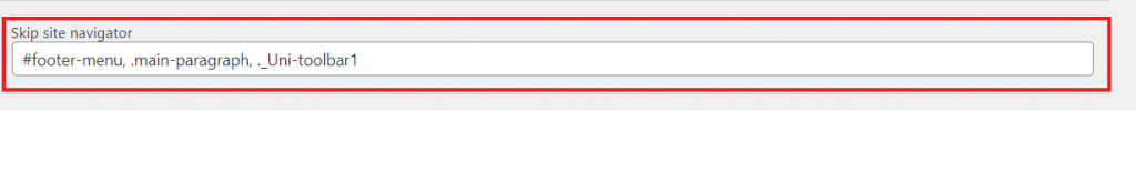
4. The “Skip site navigator” text field
- Explanation:
- The Quick Site Navigation Menu is used by those who use the “Screen Reader”, “Text Reader”, or “Voice Control” functions to quickly skip to different sections of your website, like the header, main sections of content, or the footer (Image 4). This text field will add a section to the Quick Site Navigation Menu.

- Instructions:
- Add the tag, id, or class of the element that you want to add to the Site Navigator. If you want to add multiple elements, separate them by a comma and a space
- For a class, add a “.” at the beginning, and for an id, add a “#” at the beginning (Image 5)
- To find the required HTML selectors, review the Developer tool and HTML instructions
- Add the tag, id, or class of the element that you want to add to the Site Navigator. If you want to add multiple elements, separate them by a comma and a space
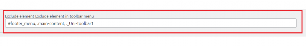
5. The “Exclude element” text field
- Explanation:
- The Quick Site Navigation Menu is used by those who use the “Screen Reader”, “Text Reader”, or “Voice Control” functions to quickly skip to different sections of your website, like the header, main sections of content, or the footer (Image 6). This text field will remove a section from the Quick Site Navigation Menu.
- Instructions:
- Add the tag, id, or class of the element that you want to take away from the Site Navigator. If you want to take away multiple elements, separate them by a comma.
- For a class, add a “.” at the beginning, and for an id, add a “#” at the beginning (Image 7)
- To find the required HTML selectors, review the Developer tool and HTML instructions
- Add the tag, id, or class of the element that you want to take away from the Site Navigator. If you want to take away multiple elements, separate them by a comma.
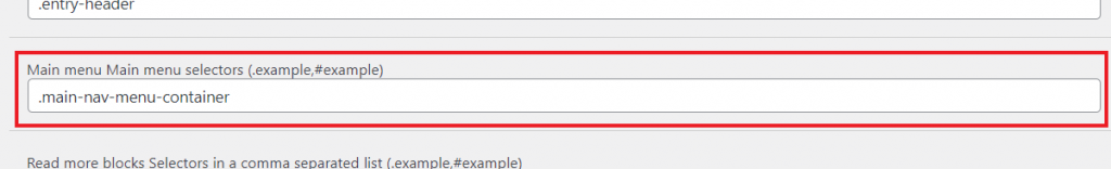
6. The “Main menu” text field
- Explanation:
- This text box is to help the Quick Site Navigator find the Main Menu if it is struggling to do so on its own. In the Quick Site Navigator (Image 8), there is an option to jump to the top of your site, or the main content area, but if you want to add another option to jump to your main menu, you can do so using this textbox. When you add your main menu selector to this textbox, another option will appear in the Quick Site Navigator menu, that will let you jump to the menu you specify.

- Instructions:
- Add the tag, id, or class of the menu you want to indicate as the “Main Menu”. This should be the section the menu is contained within, so you are looking for a “div” or “nav”. This text box should only have one selector in it, because your website should only have one main menu that is throughout the website. If your website has more than one, make sure you specify only one selector per page.
- For a class, add a “.” at the beginning, and for an id, add a “#” at the beginning (Image 9)
- To find the required HTML selectors, review the Developer tool and HTML instructions
- Add the tag, id, or class of the menu you want to indicate as the “Main Menu”. This should be the section the menu is contained within, so you are looking for a “div” or “nav”. This text box should only have one selector in it, because your website should only have one main menu that is throughout the website. If your website has more than one, make sure you specify only one selector per page.
7. Adding a Title to your Links: The Next Three Boxes
- Explanation:
- For those using the “Screen Reader” or “Text Reader” functions, when a link is read out, the Screen Reader or Text Reader generally just reads out the entirety of the link. This is often not very useful information, and does not convey what the content will be if they follow that link. These next three input fields allow for those using the “Screen Reader” or “Text Reader” functions to hear specific text about where a link is leading them.
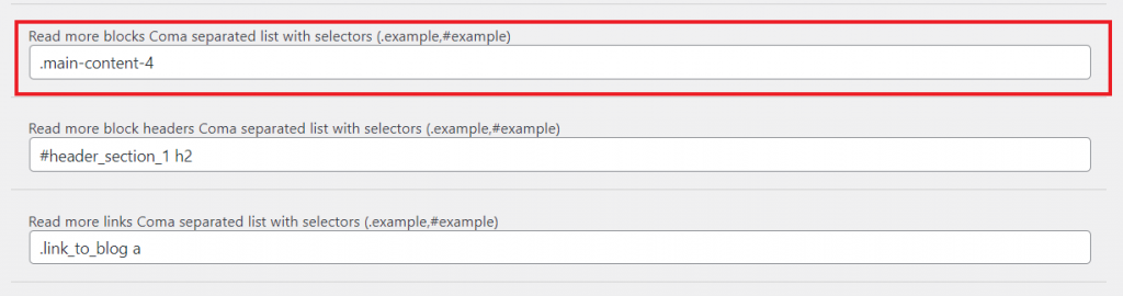
- The “Read More Blocks” Text Field
- Instructions:
- Add the tag, id, or class of the element or section that contains both a specified block header and link (Image 10). The element will most likely have some sort of section tag like “div” or “span. If you have multiple sections that you want to specify, separate them by a comma.
- For a class, add a “.” at the beginning, and for an id, add a “#” at the beginning (Image 11)
- To find the required HTML selectors, review the Developer tool and HTML instructions
- Add the tag, id, or class of the element or section that contains both a specified block header and link (Image 10). The element will most likely have some sort of section tag like “div” or “span. If you have multiple sections that you want to specify, separate them by a comma.
- Instructions:
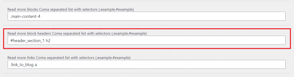
- The “Read More Headers” Text Field
- Instructions:
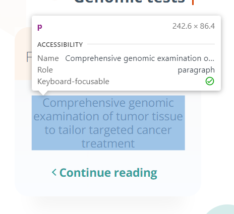
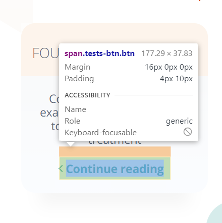
- Add the tag, id, or class of the element that contains the text you want to be read out (Image 12). If, in the block you have specified earlier, there is only one link, this field does not need to be filled out. The element will most likely be within a header element “h1-h6” or a paragraph element “p”. If you have multiple elements with text that you want to specify, separate them by a comma.
- For a class, add a “.” at the beginning, and for an id, add a “#” at the beginning (Image 13)
- To find the required HTML selectors, review the Developer tool and HTML instructions
- Add the tag, id, or class of the element that contains the text you want to be read out (Image 12). If, in the block you have specified earlier, there is only one link, this field does not need to be filled out. The element will most likely be within a header element “h1-h6” or a paragraph element “p”. If you have multiple elements with text that you want to specify, separate them by a comma.
- Instructions:
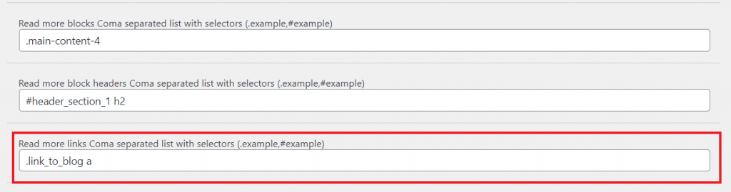
- The “Read More Links” Text Field
- Instructions:
- Add the tag, id, or class of the element that contains the link (Image 14). If, in the block you have specified earlier, there is only one header, this field does not need to be filled out. The link will be followed after “src=”, so you want to include whatever that “src” is within. This will usually be an element that has a tag “button” or “img”, but it might be text too, which could be “a”,“p”, or “h1”. If you have multiple elements with links that you want to specify, separate them by a comma.
- For a class, add a “.” at the beginning, and for an id, add a “#” at the beginning (Image 15)
- To find the required HTML selectors, review the Developer tool and HTML instructions
- Add the tag, id, or class of the element that contains the link (Image 14). If, in the block you have specified earlier, there is only one header, this field does not need to be filled out. The link will be followed after “src=”, so you want to include whatever that “src” is within. This will usually be an element that has a tag “button” or “img”, but it might be text too, which could be “a”,“p”, or “h1”. If you have multiple elements with links that you want to specify, separate them by a comma.
- Instructions:
8. The “Sidebar” Text Field
- Explanation:
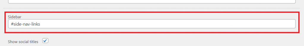
- A sidebar refers to any content, usually a menu, that is on the side of your regular site. The sidebar is not part of your regular content, and does not usually flow with the rest of the content on the page. This text box is to help the Quick Site Navigator find any Sidebar you may have. In the Quick Site Navigator (Image 16), there is an option to jump to the top of your site, or the main content area, but if you want to add another option to jump to your sidebar, you can do so using this textbox. When you add your sidebar selector to this textbox, another option will appear in the Quick Site Navigator menu, that will let you jump to the sidebar you specify.
- Instructions:
- Add the tag, id, or class of the sidebar that you want to add to the Quick Site Navigator. If you want to add multiple sidebars, separate them by a comma, but make sure that you are only adding one sidebar at most per page of your website.
- For a class, add a “.” at the beginning, and for an id, add a “#” at the beginning (Image 17)
- To find the required HTML selectors, review the Developer tool and HTML instructions
- Add the tag, id, or class of the sidebar that you want to add to the Quick Site Navigator. If you want to add multiple sidebars, separate them by a comma, but make sure that you are only adding one sidebar at most per page of your website.
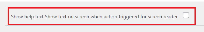
9. The “Show Help Text” Check-Box
- Explanation:
- If this box is checked (Image 19), a help pop-up (Image 18) will appear in the bottom right corner of the screen when the plugin menu is open on your website. The contents of the help pop-up will be read by the screen reader whether or not it is visible, but with this checkbox, you can turn off the visual element.
10. The “Use Adaptive Contrast” Check-Box
- Explanation:
- If this box is checked (Image 20), the toolbar can suggest and implement a more adaptive color contrast. If this box is not checked, the only color contrast colors available will be black, white, and yellow
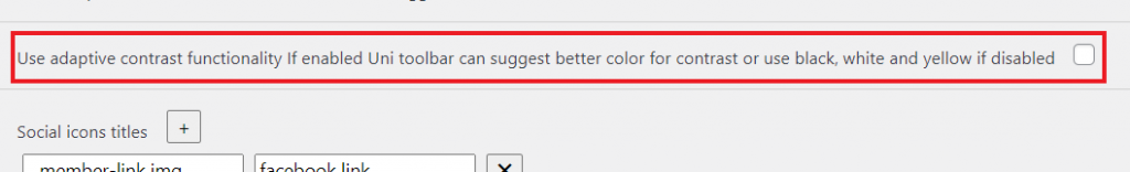
Image 21: Without Check 
Image 22: With Check
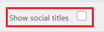
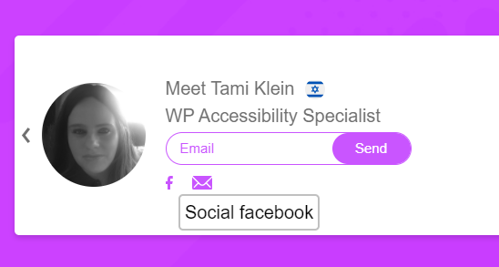
11. Social Titles
- The “Show Social Titles” Check-Box
- Explanation:
- If this box is checked (Image 23), the social icons (the images you use to indicate a link to Facebook, LinkedIn, Twitter, etc.) you have on your web page will have appropriate titles like “social Facebook” or “social Twitter”. This is helpful for those who use the “Screen Reader” or “Text Reader” functions so that instead of having their screen reader read out an image description or link and confusing a user, a user can be sure that your social icon images are links to your social media pages or email. This checkbox does not affect the titles of the social icon titles specified in the “Social Icon Titles” section.
- Explanation:
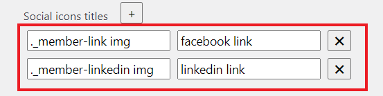
- The “Social Icon Titles” Text Fields
- Explanation:
- In this section, you can specify what certain social icons will be read as through using the “Screen Reader” or “Text Reader” or what words will pop-up when you hover your mouse over the social icon (Image 24). As an example, if you have a link to your facebook page represented by an image, you can make that img’s title say “John’s Facebook Page”. You can add as many specific titles as you want. These titles that you specify here will not be affected if the “Show Social Titles” checkbox is not checked.
- Instructions:
- Add the tag, id, or class of the social icon that you want to add a title to into the left text box or the “Set Selector” text box. Then, add the title you want that social icon to have into the right text box or the “Set Title” text box. If you want to specify multiple icons, click on the plus button
 next to the “Social Icon Titles”.
- For a class, add a “.” at the beginning, and for an id, add a “#” at the beginning (Image 25)
- To find the required HTML selectors, review the Developer tool and HTML instructions
- Add the tag, id, or class of the social icon that you want to add a title to into the left text box or the “Set Selector” text box. Then, add the title you want that social icon to have into the right text box or the “Set Title” text box. If you want to specify multiple icons, click on the plus button
- Explanation:
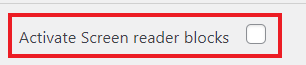
12. The “Activate Screen Reader Blocks” Check-Box
- Explanation:
- When this box is checked (Image 26), a user who is using the “Screen Reader” or “Text Reader” functions could skip sections of a webpage if they do not want their screen reader to read all of the contents of a section. For example, if the screen reader comes to a list, but a user doesn’t want the screen reader to read all of the elements in the list, they could choose to skip over the list in its entirety.
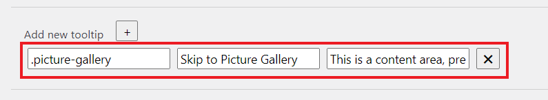
13. The “Add New Tooltip” Text Fields
- Explanation:
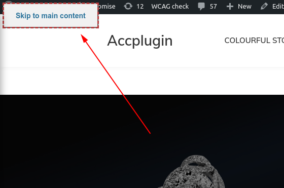
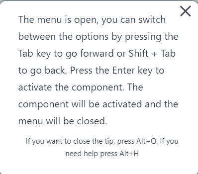
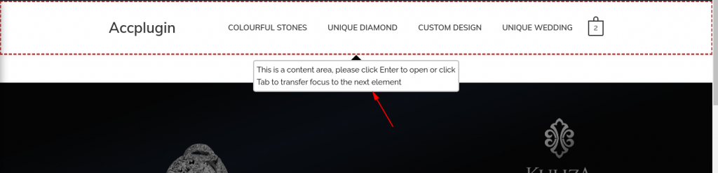
- When a user turns on the “Screen Reader” or “Text Reader” functions, instead of going directly to the top of the page, their screen reader will instead go to a menu that will allow them to access specific parts of the page without having to go element by element (Image 27). For example, sections in this Quick Navigation section may include the header, footer, and main content area. However, you might want to add sections to this menu that you feel are important, or you want a user to easily and quickly access. This text box allows this, and even allows you to add text that will be read out when a screen reader reaches it.
- Instructions:
- Click on the plus button next to “Add new tooltip”. Add the tag, id, or class of the element that you want to skip to into the left text box or the “Set Selector” text box. Then, add the name you want that section to be called in the Quick Navigation Menu into the middle text box or the “Set Name” text box. Finally, add any text you want to be read out when a user encounters this section into the right text box or the “Set Text” text box. We recommend adding text that instructs a user how to enter the specified section, or how to skip it (Image 28). If you want to specify multiple sections, click on the plus button next to the “Add New Tooltip”.
- For a class, add a “.” at the beginning, and for an id, add a “#” at the beginning (Image 29)
- To find the required HTML selectors, review the Developer tool and HTML instructions
- Click on the plus button
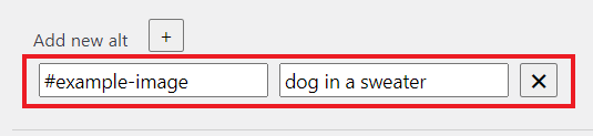
14. The “Add New Alt” Text Fields
- Explanation:
- “Alt” stands for “alternate text” and is the text that is read out for an image when the image isn’t loading or a user is using a screen reader. An image’s alt describes what is in an image in concise and clear text, or if the information in the image is conveyed elsewhere on the page, is blank. Sometimes, an image’s alt is gibberish or is too vague, so the alt has to be manually changed.
- Instructions:
- Click on the plus button next to “Add new alt”. Add the tag, id, or class of the image that you want to add an alt to into the left text box or the “Set Selector” text box. Then, add the text you want that image to have into the right text box or the “Set Text” text box. If you want to add alternate text to multiple images, click on the plus button next to the “Add new alt”.
- For a class, add a “.” at the beginning, and for an id, add a “#” at the beginning (Image 30)
- To find the required HTML selectors, review the Developer tool and HTML instructions
- To see what alt you should add to an image, review the Alt Decision Tree
- Click on the plus button
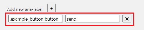
15. The “Add New Aria-Label“ Text Fields
- Explanation:
- An Aria-Label is used to label elements that do not have text to describe what they are on the screen. An example of this would be an “X” mark that closes a page, but does not say “X to close page”. An Aria-Label would be needed here for those using the “Screen Reader” or “Text Reader” functions so that they can know what the “X” indicates. Aria-Labels are also used for buttons, videos, or in filling out forms.
- Instructions:
- Click on the plus button next to “Add new aria-label”. Add the tag, id, or class of the element that you want to add an aria-label to into the left text box or the “Set Selector” text box. Then, add the label you want that element to have into the right text box or the “Set Text” text box. If you want to add an aria-label to multiple elements, click on the plus button next to the “Add new aria-label”.
- For a class, add a “.” at the beginning, and for an id, add a “#” at the beginning (Image 31)
- To find the required HTML selectors, review the Developer tool and HTML instructions
- To see what aria-label you should add to an element, review this article
- Click on the plus button
16. The “Use Keyboard Mode on Toolbar” Check-Box
- Explanation:
- Keyboard Mode allows a user to navigate a website using a keyboard instead of a mouse. This is helpful for those who might have motor disabilities. When this checkbox is checked (Image 32), it will add a “Keyboard” option to your plugin on your site that will allow a user to navigate your website (Image 33).
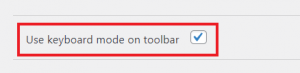
Image 32 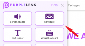
Image 33
17. The “Use Autofocus With Anchors” Check-Box
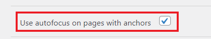
- Explanation:
- Anchors occur when a link on a webpage sends you to a different spot on the same webpage, rather than sending you somewhere else. When this happens, it is often hard for a screen reader to know where the page has jumped, and instead of jumping to the spot where the anchor is sending someone, a screen reader will often just continue on the page as if no jump had occurred. Therefore, we recommend that you check this checkbox (Image 34), so that those using the “Screen Reader” and “Text Reader” functions can utilize every aspect of your site.
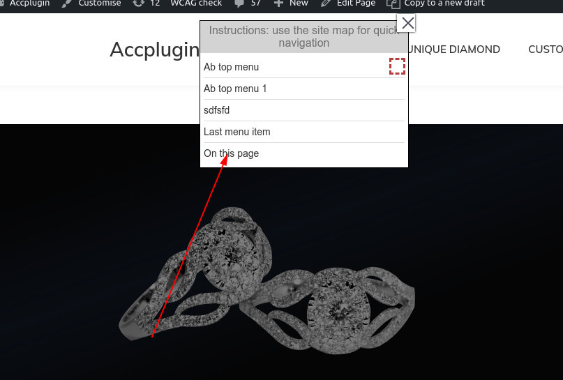
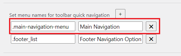
18. The “Set Menu Names” Text Fields
- Explanation:
- In the sitemap on your website are a list of menus that are on your site, like the main navigation menu, or any lists you may have (Image 35). Purple-Lens automatically generates names for these menus and lists, but you may want to rename them to better describe what is in each menu or list.
- Instructions:
- Click on the plus button next to “Set the Menu Names in the Sitemap”. Add the tag, id, or class of the menu whose name you want to change into the left text box or the “Set Selector” text box. Then, add the name you want that menu to have into the right text box or the “Set Title” text box. If you want to add a name to multiple menus, click on the plus button next to the “Set the Menu Names in the Sitemap”.
- For a class, add a “.” at the beginning, and for an id, add a “#” at the beginning (Image 36)
- To find the required HTML selectors, review the Developer tool and HTML instructions
- Click on the plus button
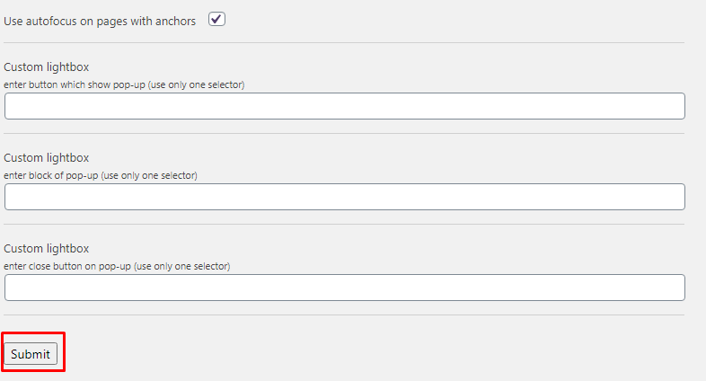
19. The “Popup Configuration” Text Fields
- Explanation:
- When a pop-up appears, those using the “Screen Reader” or “Text Reader” might want to hear what is on the pop-up, but their screen reader might not know what to focus on, or what closes the pop-up, these next three text boxes will help with those issues. By entering the proper elements into the next boxes, those using the “Screen Reader” and “Text Reader” functions will be able to smoothly transition from a link to the pop-up, to the pop-up content, and back to the main content page all by using just their screen reader.
- Instructions:
- Click on the plus button next to “Custom lightbox”. Add the tag, id, or class of the element that contains the entirety of the pop-up into the left text box or the “Set Selector” text box (Image 37). Then, add the selector, or link, that opens the pop-up into the middle text box or the “Set Open” text box (Image 38). Finally, add the selector, or link, that closes the pop-up into the right text box or the “Set Close” text box (Image 39). If you want to specify multiple pop-ups, click on the plus button next to the “Add New Pop-up”.
- For a class, add a “.” at the beginning, and for an id, add a “#” at the beginning (Image 40)
- To find the required HTML selectors, review the Developer tool and HTML instructions
- Click on the plus button
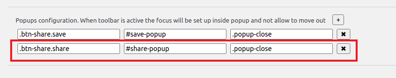
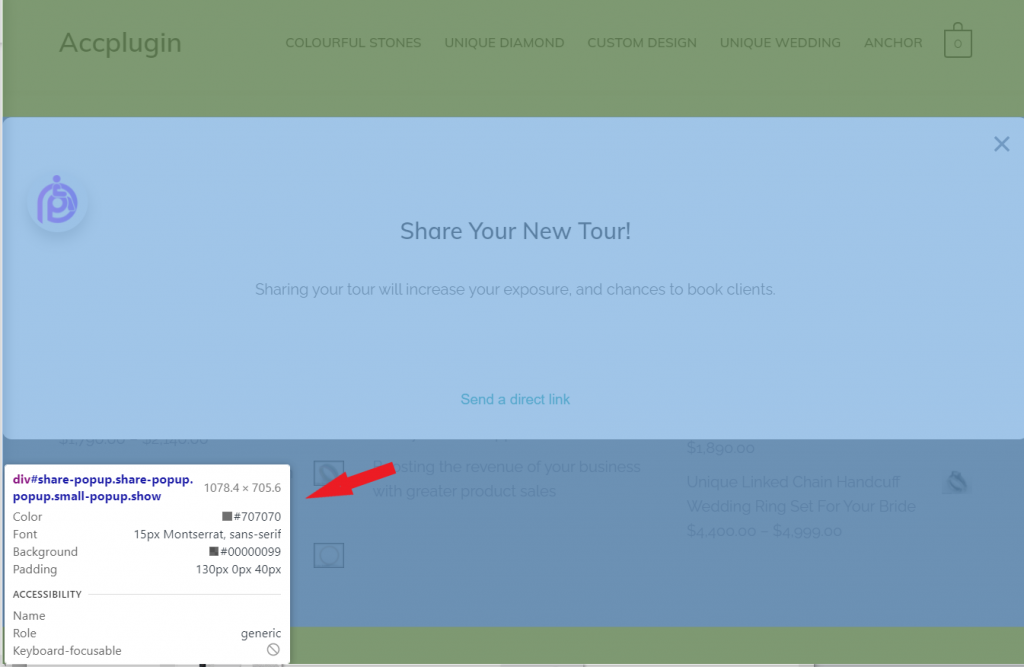
Image 37: Pop-Up Selector 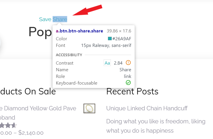
Image 38: Pop-Up Opener 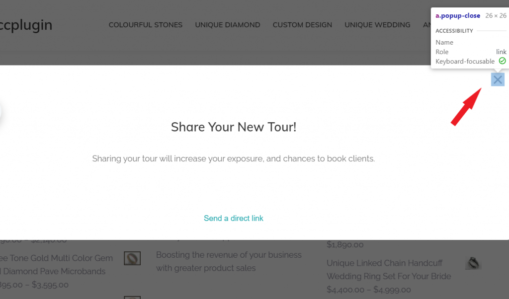
Image 39: Pop-Up Closer
22. “Submit” button
Click on the “Submit” button to save all changes (Image 41).